A Six Word Story
A Six Word Story
A Six Word Story
Type
Type
(
(
2020
2020
)
)

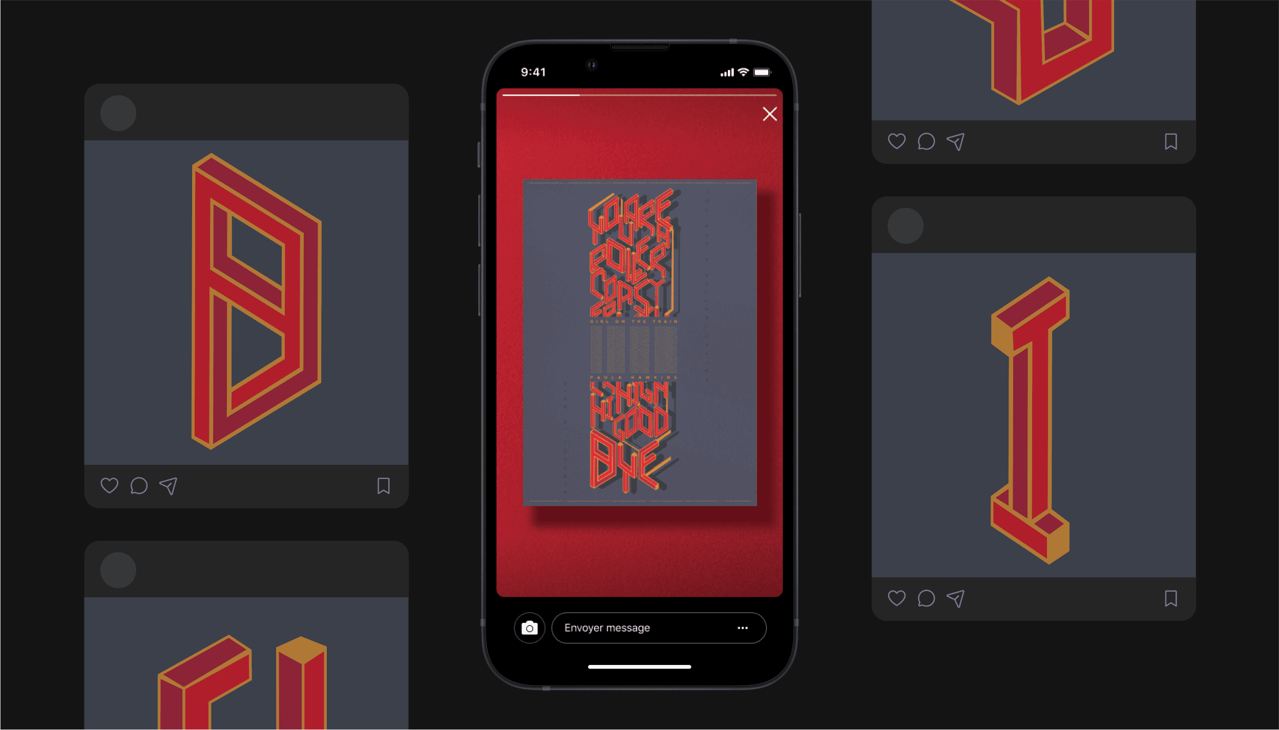
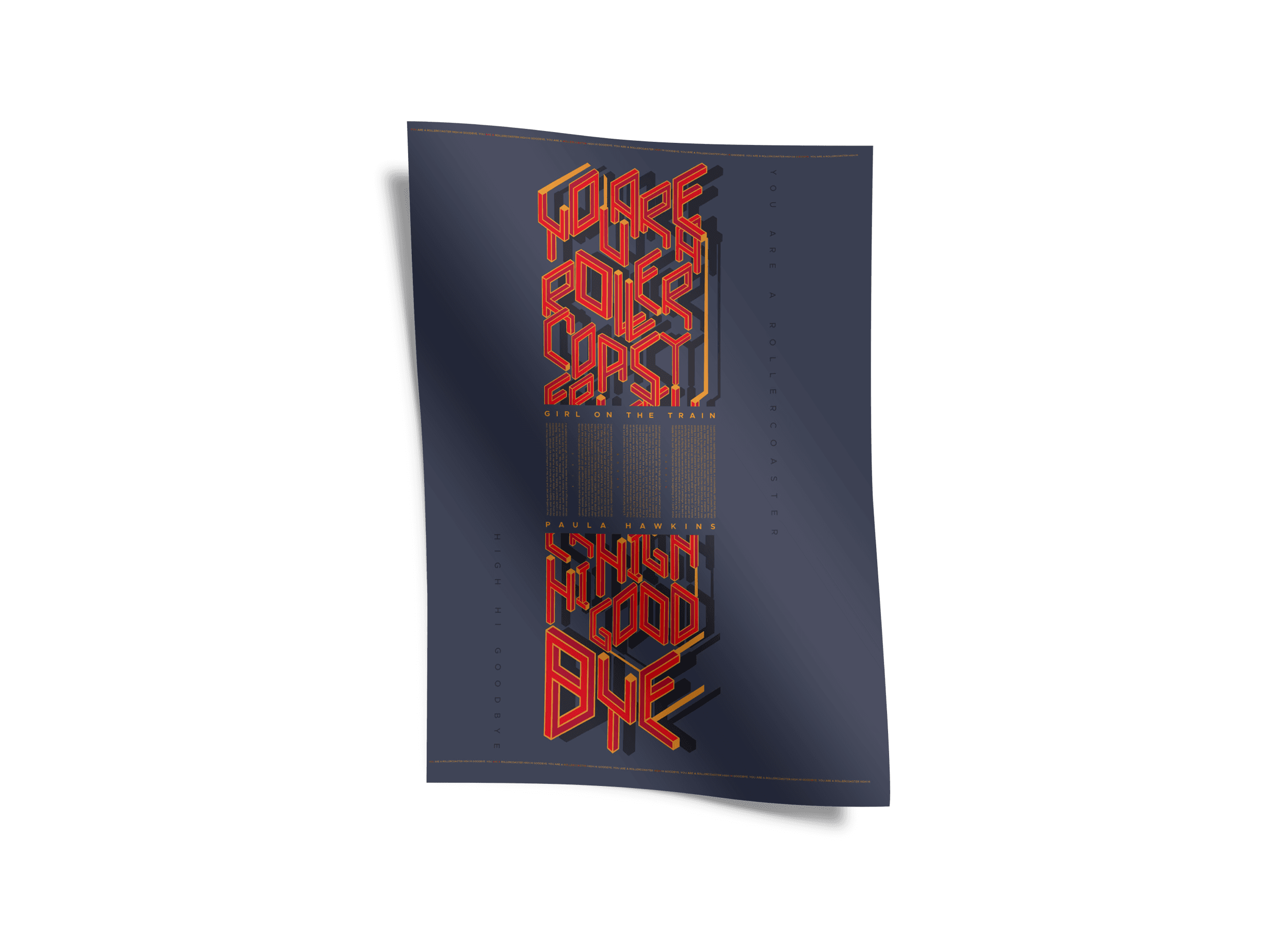
A university project using six words from ''Girl on the Train'' to create an award-winning poster that challenges typography to evoke perspective and themes of misunderstanding.
A university project using six words from ''Girl on the Train'' to create an award-winning poster that challenges typography to evoke perspective and themes of misunderstanding.
A university project using six words from ''Girl on the Train'' to create an award-winning poster that challenges typography to evoke perspective and themes of misunderstanding.
Client
Client
Type
Type
Year
Year
(
(
2020
2020
)
)
Services
Services
Layout
Layout
,
,
Typography
Typography
,
,
Print Production
Print Production
The Goal
The Goal
My primary mission for this project was to challenge and extend meaning beyond traditional typography.
This project aimed to stretch the boundaries of typography, using six words to create a poster that reflects the chaotic and misunderstood essence of Girl on the Train by Paula Hawkins. The goal was to experiment with type size, orientation, and layout to evoke the book's themes of confusion and perspective.


Process & Challenge
Process & Challenge
Throughout the project, I had to overcome initial drafts, color printing issues, and embrace playfulness.
The primary drafts initially lacked the desired creativity, and color inconsistencies in printing added to the difficulties. My initial reluctance to be playful was another challenge, but encouragement from peers and professors to consider "what ifs" led to a more experimental and engaging design. Designing an isometric typeface in Illustrator required innovative manipulation of type and layout to convey disorientation, breaking conventional typography rules to reflect the chaotic narrative of Girl on the Train.
The Outcome
The Outcome
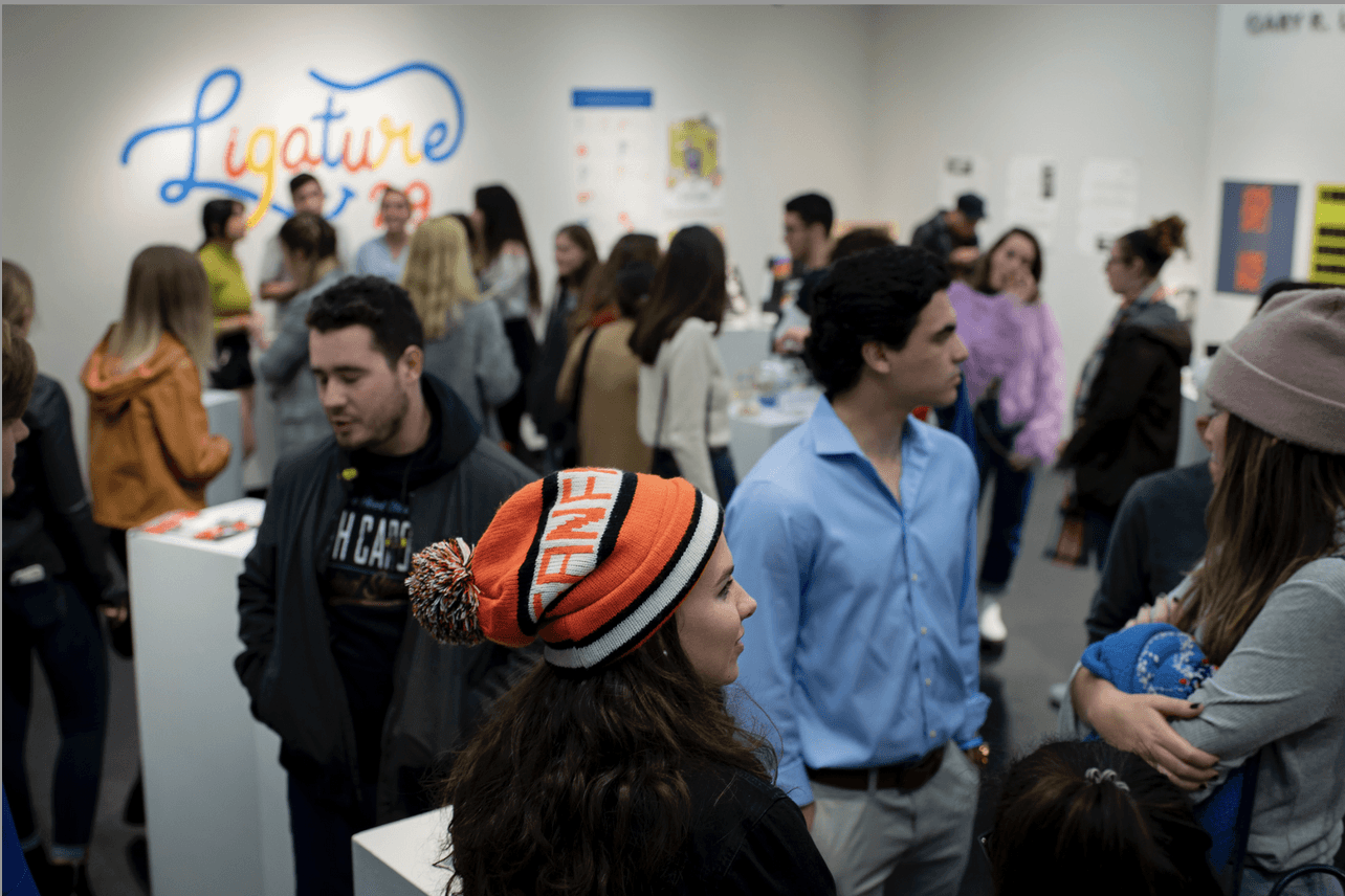
Despite the challenges, this poster became an award-winning experimental design at Ligature 29.
Nominated at the University of Florida for its innovative use of type and layout, this project pushed me to embrace playfulness, break rules, and foster creativity, echoing the narrative depth of Girl on the Train. Reflecting on the process, I see opportunities for improvement like refining type details and exploring different typeface softwares. This experience underscored the value of playful experimentation in design, demonstrating how design techniques and meanings can evolve dynamically.


What’s next?
What’s next?
What’s next?

A UX strategy project for Stanley Access, focused on streamlining how expert users locate and download high-value technical documents.
User Experience
Information Architecture
Interaction Design
A UX strategy project for Stanley Access, focused on streamlining how expert users locate and download high-value technical documents.
User Experience
Information Architecture
Interaction Design

A student-led design symposium exploring how creativity shapes culture and conversation.
Branding
Web Design
Motion Graphics
A student-led design symposium exploring how creativity shapes culture and conversation.
Branding
Web Design
Motion Graphics