
EnBW needed a refresh of the illustration system inside their mobile app, Zuhause+. The existing visuals needed more depth and versatility, and the work had to stay grounded in the brand while feeling modern enough to serve a broad user base.
Working as part of the team at 1042.studio, I designed geometric, metaphor-driven illustrations in Figma, drawing from EnBW's brand history and the visual language of the energy industry. Each illustration was built to communicate clearly at small sizes, support accessibility, and hold up across the different contexts the app uses them in.
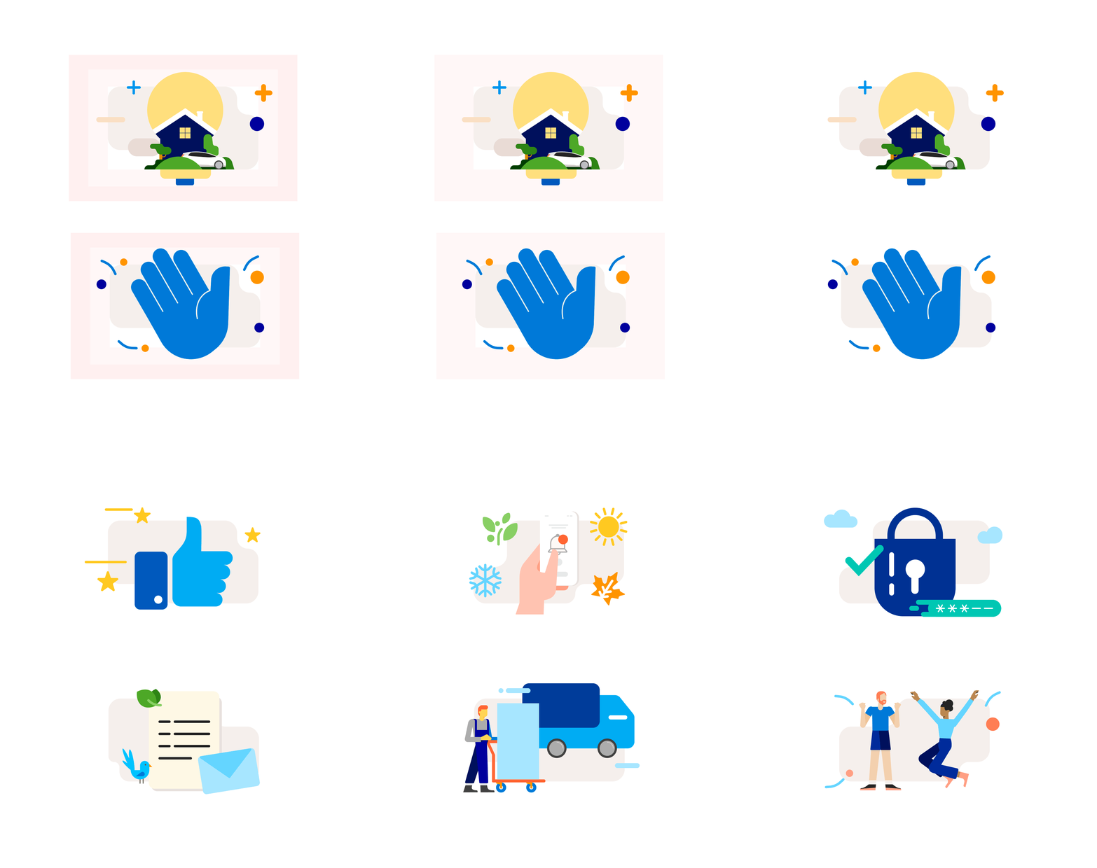

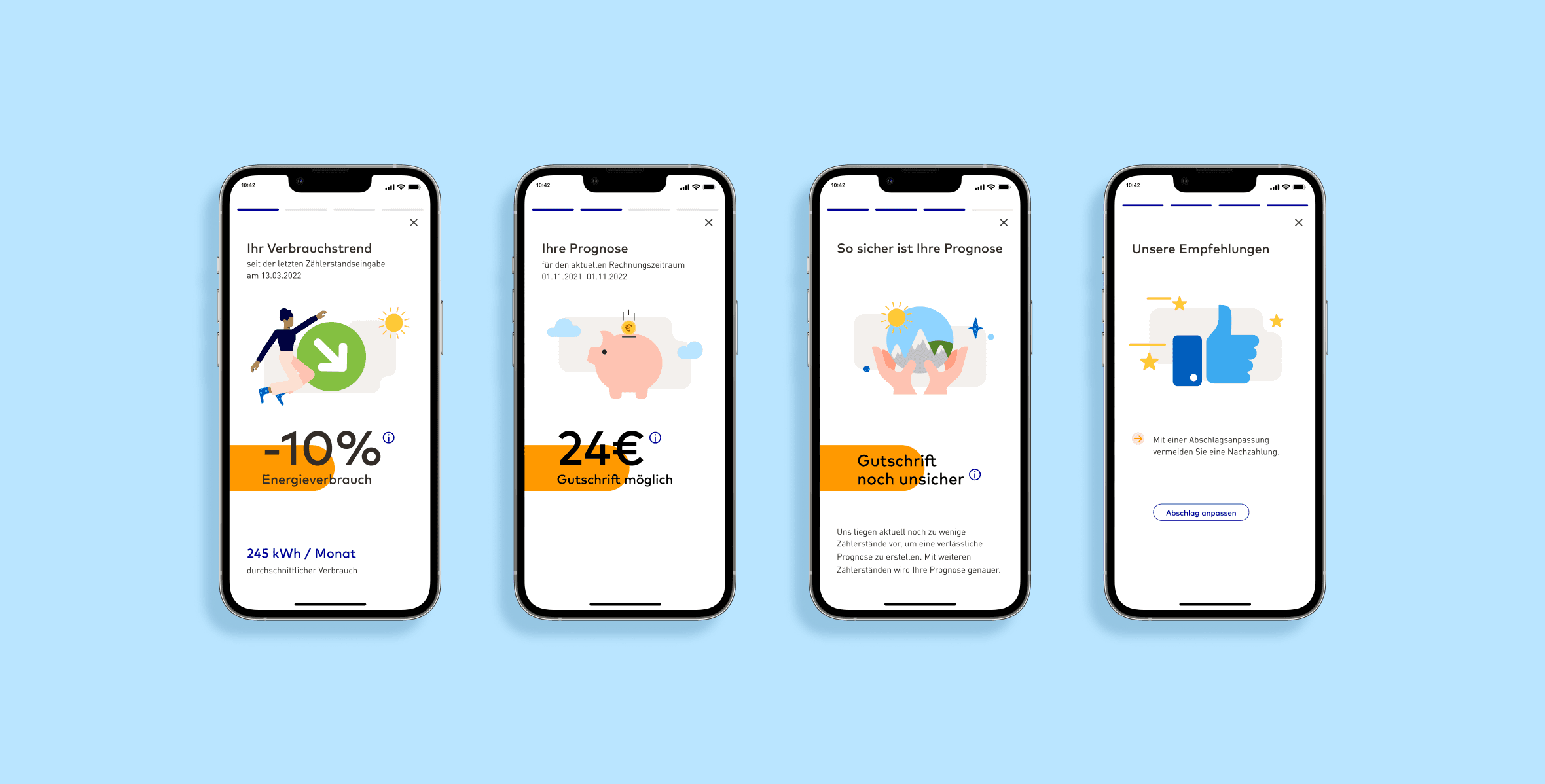
The refreshed illustration set elevated the overall UX of the app, replacing generic visuals with a cohesive system that felt specific to EnBW. The work made the product feel more considered and easier to navigate for a wide range of users.

